The secret to a good web design lies in a successful font selection. While it is more challenging to create a design having a wide font selection, rather than using one font, it is possible. A web design will work if the font is chosen carefully, thought through, and been experimented with.
The font choices that the designer makes, provide the web with character, and are thought to reveal the creator’s personality. Thus, one must first think of the message that the design should convey, and then begin dressing it up.
To begin with, the first stage of a web design, the “interface”, should be all about the text.
A good font is the foundation of the design. Therefore, any poor choices will weaken it, and the rest of the additions will only make it worse.
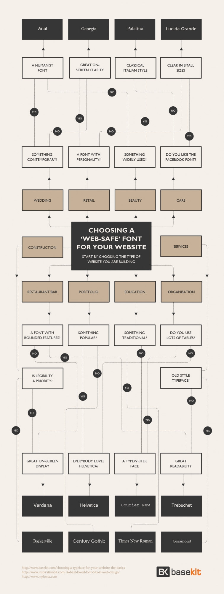
The most important thing to consider when working with text is its readability. While some fonts are with no doubt more attractive than others, they may be destructive and hard to read. So, they should be carefully chosen, or else avoided. For instance, Helvetica is one of the most overused fonts. It fits with almost any design and works well in small and in huge sizes. In some cases some fonts that perfectly go with the theme of the web, might hurt the eyes if used thoroughly. Yet, there is a solution. Firstly, unlike the usually large titles that are easy to figure out, the body copy is the part of the design that must be most readable. Therefore, the best way to decide on the right font is to try each one. Also, very important to remember is the fact that mostly users will not be concentrating on the type of font that is used but rather on whether it is easy to read or not. So, once the text is easy to read, the font works. Secondly, a web design may include more than one font. Without going crazy, a designer may include one font as a header, while different ones for other text. For example, sometimes the appropriate pairing would be two sans-serifs, while other times, sans could work for the headlines and serif used for the body copy. That, in fact, may be a good idea that will create some kind of dynamics to the web and provide an enjoyable experience to the target audience. However, to do so, it is crucial to experiment and try all of the fonts by putting them side by side, and possibly consult with visitors, family, and friends. The point is to keep in mind that as long as the fonts convey the message strongly, they work.
To sum up, the appearance of the typography is very important. Since typography is the foundation of a web site, it is a very important element. Typography is the key to whether the web site will work or not. It provides user experience by navigating, communicating, and informing the user. By making the wrong choices, the wrong ideas might be sent out. If the chosen fonts do not work, it is better to avoid them. Moreover, there is no set of rules to follow when creating a design, thus it is recommended to experiment and to consult your visitors.